
感谢大家对上一篇文章的评论,这确实意义重大。我希望你能从这篇文章中学到一两件事。
在本文中,我们将探讨 css 中的两个基本概念——定位和布局。定位和布局是创建具有视觉吸引力和功能性的网页的核心。掌握这些概念可以让您制作出增强用户体验的响应式设计。最后,您将了解如何使用这些技术像专业人士一样构建您的网页。
- 定位和布局
css 定位控制元素在网页上的定位或放置方式。如果适用,定位会受到顶部、底部、左侧和右侧偏移值的影响。有 5 个主要的 css position 值;
1。静态: 默认情况下,所有 html 元素都是静态定位的。这仅仅意味着元素不变,不移动,并且不受上、下、左、右偏移值的影响。
2。相对: 元素相对于其正常位置定位。
3。绝对: 元素相对于其最近的祖先(父级)或视口定位。
4。已修复: 元素相对于视口定位并在滚动期间保持固定。
5。粘性: 粘性定位允许元素根据滚动位置和偏移值上、下、左、右在相对位置和固定位置之间切换。
下面是解释 css 定位的插图。
这是帮助使插图栩栩如生的代码。欢迎自行复制修改。
<!doctype html>
<html lang="en">
<head>
    <meta charset="utf-8">
    <meta name="viewport" content="width=device-width, initial-scale=1.0">
    <title>css positioning</title>
    <link rel="stylesheet" href="style.css">
</head>
<body>
    <div class="container">
        <div class="static">
            <h2>static position</h2>
            <p>this div has a static position. it is positioned relative to its normal position, which means it will not be affected by the positioning properties of other elements.</p>
        </div>
        <div class="relative">
            <h2>relative position</h2>
            <p>this div has a relative position. it is positioned relative to its normal position, and it can be moved using the top, bottom, left, and right properties.</p>
        </div>
        <div class="absolute">
            <h2>absolute position</h2>
            <p>this div has an absolute position. it is positioned relative to the nearest positioned ancestor, which means it will be affected by the positioning properties of other elements.</p>
        </div>
        <div class="fixed">
            <h2>fixed position</h2>
            <p>this div has a fixed position. it is positioned relative to the viewport, which means it will stay in the same place even when scrolling.</p>
        </div>
        <div class="sticky">
            <h2>sticky position</h2>
            <p>this div has a sticky position. it is positioned relative to the nearest positioned ancestor, but it will not be affected by the positioning properties of other elements. it will stay in its original place until it crosses a specified threshold.</p>
        </div>
    </div>
</body>
</html>
*{
    margin: 0;
    padding: 0;
    box-sizing: border-box;
}

body{
    font-family: arial, sans-serif;
    background-color: #f2f2f2;
    display: grid;
    place-content: center;
    min-height: 100vh;
}

.container{
    width: 100%;
    max-width: 1200px;
    height: auto;
    display: grid;
    grid-template-columns: repeat(auto-fill, minmax(300px, 1fr));
    border: 1px solid red;
    gap: 20px;
    padding: 20px;
}

.static{
    background-color: #ccc;
    padding: 20px;
    border: 1px solid black;
    width: 300px;
    position: static;

}

.relative{
    background-color: #ccc;
    padding: 20px;
    border: 1px solid black;
    width: 300px;
    position: relative;
    top:30px;
    right: 30px;

}

.absolute{
    background-color: #ccc;
    padding: 20px;
    border: 1px solid black;
    width: 300px;
    position: absolute;
    top: 30px;
    right: 100px;
}

.fixed{
    background-color: #ccc;
    padding: 20px;
    border: 1px solid black;
    width: 300px;
    position: fixed;
    bottom: 0;
    right: 0;
}

.sticky{
    background-color: #ccc;
    padding: 20px;
    border: 1px solid black;
    width: 300px;
    position: sticky;
    top: 0;
    right: 0;
}
— 暂停,深呼吸,然后继续!!—
- css 布局
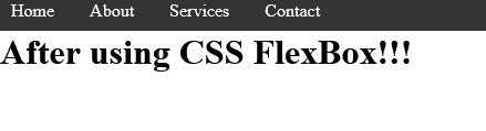
1。 flexbox:这是一种一维布局方法,用于在单轴(水平和垂直)上布局项目。
flexbox 的特点
- display: flex - 这会为容器创建一个弹性框。
- align-items: center - 这控制容器的垂直对齐。
- justify-content: space- between - 这控制容器的水平对齐方式。
- 间隙:在不需要边距的情况下增加弹性项目之间的间距。
这是一个简单导航栏的前后对比
<!doctype html>
<html lang="en">
<head>
    <meta charset="utf-8">
    <meta name="viewport" content="width=device-width, initial-scale=1.0">
    <title>navigation bar using css flexbox</title>
    <link rel="stylesheet" href="style.css">
</head>
<body>
    <div class="container">

        <nav>

            <ul>
                <li><a href="#">home</a></li>
                <li><a href="#">about</a></li>
                <li><a href="#">services</a></li>
                <li><a href="#">contact</a></li>
            </ul>
        </nav>
    </div>
</body>
</html>
* {
  margin: 0;
  padding: 0;
  box-sizing: border-box;
}

body {
  min-height: 100vh;
}

li {
  list-style: none;
}
a {
  text-decoration: none;
  color: white;
}
nav {
  background-color: #333;
  color: #fff;
  padding: 10px;
}

ul {
  display: flex;
  align-items: center;
  gap: 2rem;
}
结果:
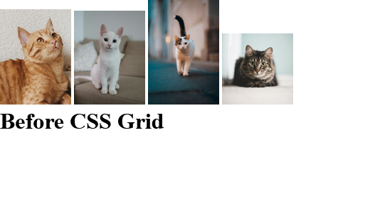
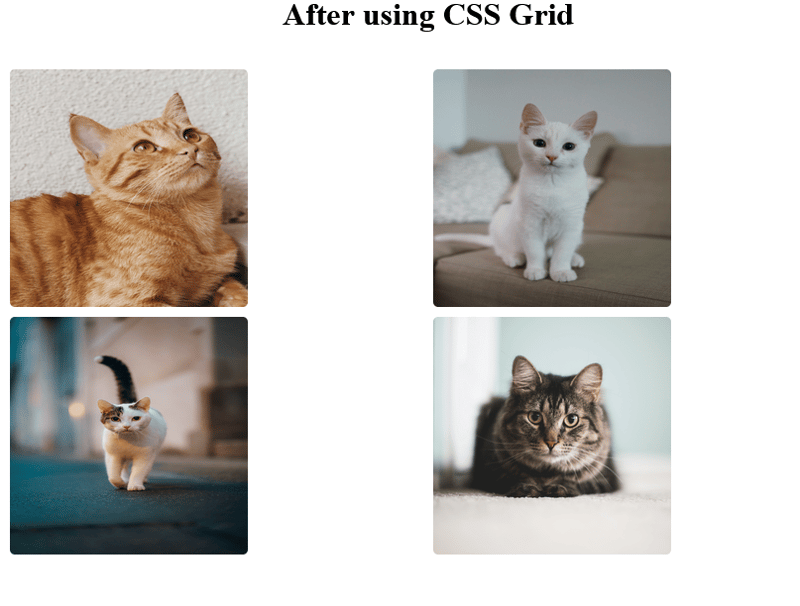
2。网格:这是一种用于创建行和列的二维布局方法。
特点
- display: grid - 这会为容器创建一个网格。
- grid-template-columns/grid-template-rows - 这定义了容器的行或列。
- repeat(2, 1fr) - 这将创建 2 个等宽列。
- 间隙:10px-增加网格项目之间的间距。
这是我在 unsplash 上找到的一些猫照片的前后对比。
<!doctype html>
<html lang="en">
  <head>
    <meta charset="utf-8" />
    <meta name="viewport" content="width=device-width, initial-scale=1.0" />
    <title>css grid using cat photos</title>
    <link rel="stylesheet" href="style.css" />
  </head>
  <body>
    <div class="container">
      <div class="cat-photos">
        @@##@@

        @@##@@

        @@##@@

        @@##@@
      </div>
    </div>
  </body>
</html>
* {
  margin: 0;
  padding: 0;
  box-sizing: border-box;
}

body {
  min-height: 100vh;
}

.container {
  margin: 0 auto;
  width: 950px;
  padding: 1rem;
}

.cat-photos {
  padding: 2rem;
  display: grid;
  grid-template-columns: repeat(2, 1fr); /* Creates 2 equal-width columns */
}

img {
  border: 5px solid white;
  border-radius: 10px;
  width: 250px;
  height: 250px;
}
结果:


比较表
定位和布局是css的基础。了解何时以及如何使用它们不仅会让您的造型体验变得更加轻松,而且更加愉快和高效。虽然本文将带您开始使用 flexbox 和 grid,但我很快就会发布更深入的指南,探索它们的高级功能、提示和技巧。请继续关注!
这就是掌握css基础知识的总结!我希望你喜欢阅读这篇文章,就像我喜欢写它一样。但在我们分别之前,我很想听听你的消息:
您的项目更喜欢哪种 css 布局方法 - flexbox 还是 grid?为什么?
欢迎在下面的评论中分享您的想法。
再见了!!!!


以上就是CSS 并不难(你只是缺少这些基础知识)- 掌握基础(第 2 部分)的详细内容,更多请关注知识资源分享宝库其它相关文章!
版权声明
本站内容来源于互联网搬运,
仅限用于小范围内传播学习,请在下载后24小时内删除,
如果有侵权内容、不妥之处,请第一时间联系我们删除。敬请谅解!
E-mail:dpw1001@163.com


发表评论